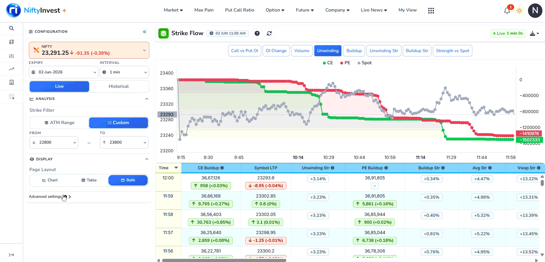
Screen overview
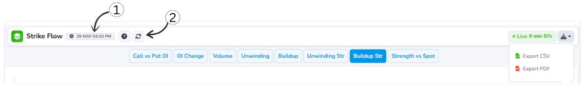
1Last Updated Time
Shows the exact moment when the data was last refreshed. This timestamp helps you verify the recency of the information so you can base decisions on the most current market conditions.
2Refresh Toggle
This button allows you to manually trigger a data refresh or toggle automated updates, ensuring you are tracking market shifts in real-time without losing your current analysis layout.
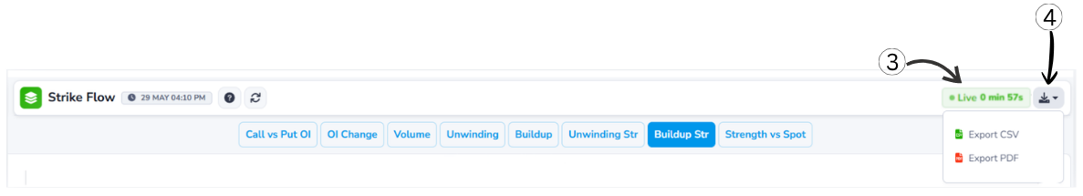
3Live Status Indicator
Shows that the displayed data is real-time market data and is being continuously refreshed. It also displays the time passed since the last data update, so you can see how fresh the information is.
4Download Options
Lets users export the displayed data for offline use or record keeping.
Chart-Options
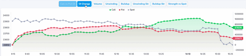
Allows you to switch between different metrics and visualization modes (such as Call vs Put OI, OI Change, Volume, Max Pain, or PCR). This enables you to dynamically swap the underlying data layers on the chart to analyze market sentiment from multiple angles without reloading the page.
Header Controls
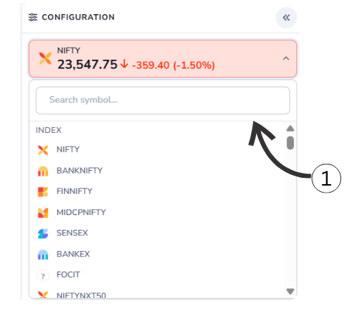
1Symbol Selection Dropdown
Lets users choose the market index or symbol (e.g., NIFTY 50, BANK NIFTY, FINNIFTY). Selecting a different symbol updates the data to show Strike Flow (combined analysis) specific to that index.
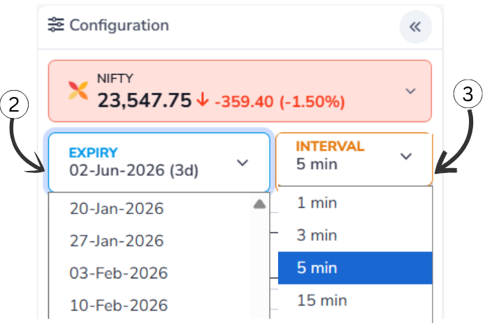
2Expiry Date Dropdown
Opens a list of available expiry dates. By selecting a different expiry date, users can view Strike Flow (combined analysis) data for that specific expiry, making it useful for historical and comparative analysis.
3Interval Selection Dropdown
Lets users choose the time interval (such as 1 min, 5 min, 15 min, or 30 min) for data calculation. A smaller interval shows more frequent changes, while a larger interval provides a smoother and broader market view.
Historical Data
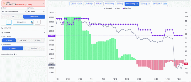
4Historical Date Selection
Allows users to navigate to a specific past date to view historical Strike Flow data. By selecting a date from the calendar, all charts and table data update to reflect the market activity on that day, making it useful for backtesting and trend analysis.
ATM Range
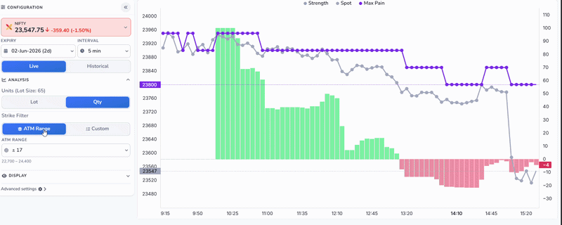
6ATM Range Selection
Allows users to select a predefined range of strike prices around the At-The-Money (ATM) level. Instead of manually setting start and end strikes, choosing an ATM range automatically centers the analysis around the current market price, making it quicker to focus on the most relevant strikes.
7Custom Strike Selection
Gives users full control to manually define a specific strike price range for analysis. This is useful when you want to focus on a particular zone beyond the ATM range, enabling targeted analysis of specific support or resistance levels in the option chain.
Chart/Graph
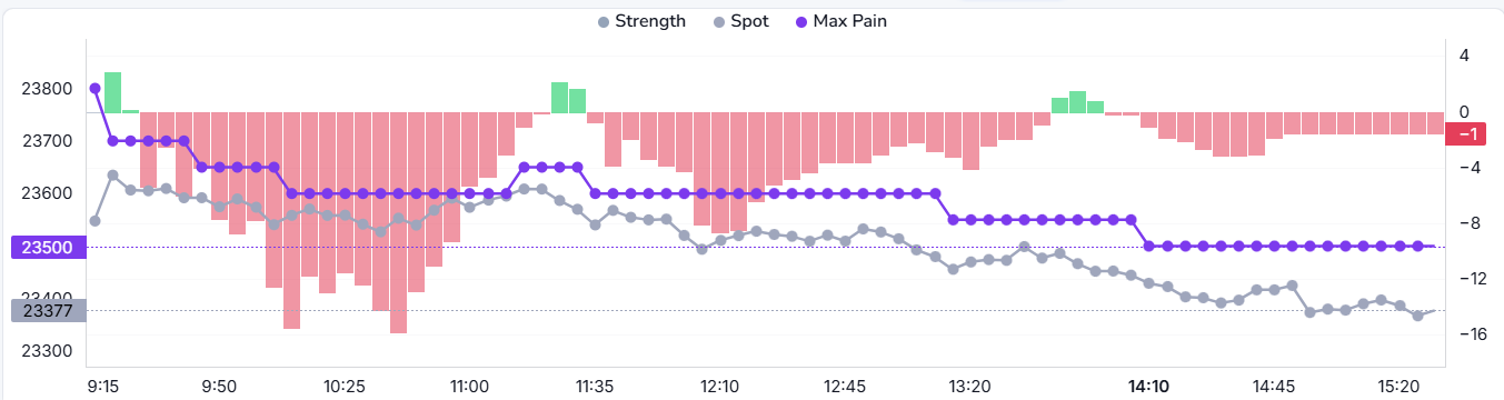
1. Unwinding / Strength Graph
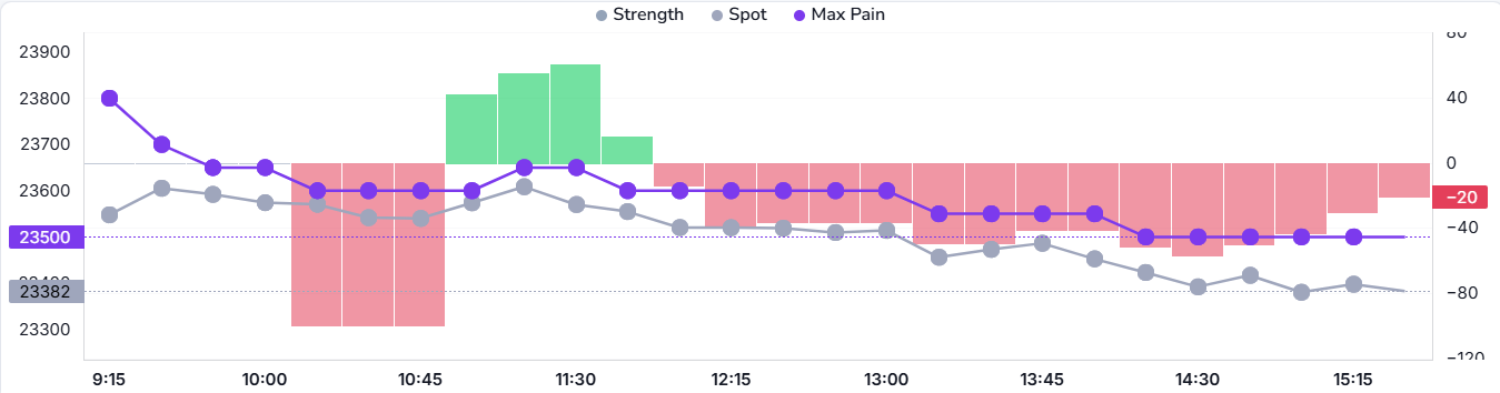
Unwinding (Line Chart)
- The X-axis shows the trading time from 9:15 to 15:15.
- Left Y-Axis shows the Option OI Unwinding value in lots / lakh contracts.
- Zero line means no change in positions.
- Values below zero indicate positions are being closed (unwinding).
- More negative value = stronger unwinding pressure.
- Right Y-Axis shows the actual price (LTP) of the stock or index.
CE Unwinding (Green Line)
- Shows Call option positions being unwound during the day.
- Line moving downward means call writers are exiting positions.
- Sharp fall indicates strong call unwinding.
- Suggests reduction in bullish expectations.
PE Unwinding (Red Line)
- Shows Put option positions being unwound during the day.
- Line moving downward means put writers are exiting positions.
- Sharp fall indicates strong put unwinding.
- Often seen after a market move or near exhaustion.
Stock LTP (Grey Line)
- Represents the actual price movement of the stock or index.
- Falling LTP shows market weakness, rising LTP shows market strength.
Unwinding Strength % (Bar Chart)
- Displays the strength of unwinding in percentage terms.
- Bars above zero indicate strong unwinding, taller bars mean aggressive position exits.
- Bars below zero indicate resistance or opposite-side dominance.
How Both Charts Work Together
- Line chart shows which positions are unwinding and how much.
- Bar chart shows how strong that unwinding is.
- Unwinding with falling LTP confirms bearish pressure.
- Strong unwinding on both CE and PE suggests trend exhaustion.
2. Buildup / Strength Graph
Buildup (Line Chart)
- The X-axis shows the trading time from 9:15 to 15:15.
- Left Y-Axis shows the Option OI Buildup value in lots / lakh contracts.
- Zero line means no new positions added.
- Values above zero indicate new positions are being created (buildup).
- Higher value = stronger position buildup.
- Right Y-Axis shows the actual price (LTP) of the stock or index.
CE Buildup (Green Line)
- Shows Call option positions being added during the day.
- Line moving upward means new call positions are created.
- Steady rise indicates consistent call buildup.
- Represents increasing resistance or bullish writing.
PE Buildup (Red Line)
- Shows Put option positions being added during the day.
- Line moving upward means new put positions are created.
- Gradual rise indicates steady put buildup.
- Represents support creation or downside protection.
Stock LTP (Grey Line)
- Represents the actual price movement of the stock or index.
- Falling LTP shows market weakness, rising LTP shows market strength.
Buildup Strength % (Bar Chart)
- Displays the strength of buildup in percentage terms.
- Bars below zero indicate strong buildup pressure.
- Deeper bars mean more aggressive position creation.
- Gradual reduction in depth shows weakening buildup.
How Both Charts Work Together
- Line chart shows which option side is building positions.
- Bar chart shows how strong that buildup is.
- CE buildup with falling LTP indicates call writing pressure.
- PE buildup with stable or falling LTP indicates support formation.
- Strong buildup with weak price movement suggests range-bound or capped market.
3. Call OI vs Put OI Graph
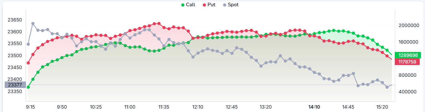
Green Line – CE OI
- Represents the total Call Open Interest across selected strikes.
- Rising line indicates call positions are being added, reflecting resistance building.
Red Line – PE OI
- Represents the total Put Open Interest across selected strikes.
- Rising line indicates put positions are being added, reflecting support building.
Stock LTP (Grey Line)
- Represents the spot price movement during the trading session.
- Helps confirm whether OI activity aligns with price action.
How to Read
- When CE OI is higher than PE OI, it indicates stronger call writing — bearish resistance at those levels.
- When PE OI is higher than CE OI, it indicates stronger put writing — bullish support at those levels.
- Crossovers between the two lines signal a shift in market sentiment.
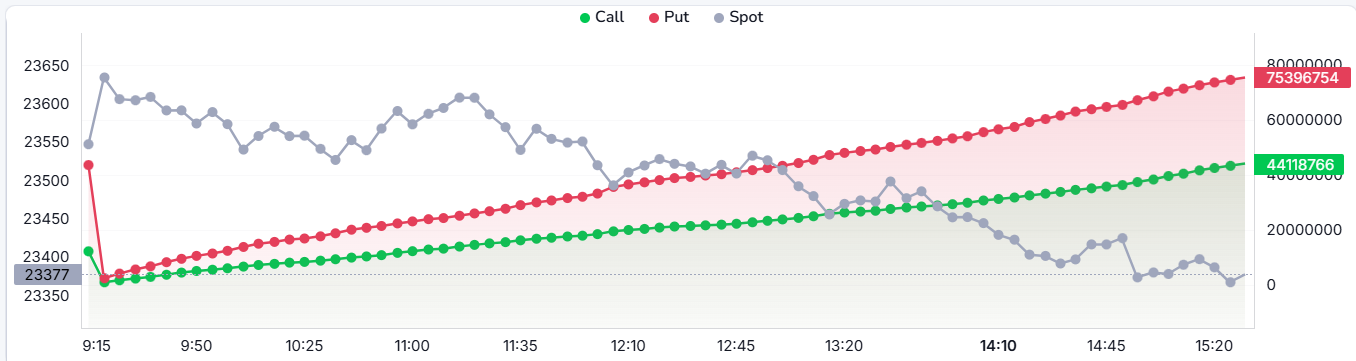
4. Call OI Chg vs Put OI Chg Graph
Green Line – CE OI Chg
- Shows the intraday change in Call Open Interest.
- Rising line means new call positions are being added during the session.
- Falling line means call positions are being closed or unwound.
Red Line – PE OI Chg
- Shows the intraday change in Put Open Interest.
- Rising line means new put positions are being added during the session.
- Falling line means put positions are being closed or unwound.
Stock LTP (Grey Line)
- Represents the spot price movement throughout the session.
- Helps correlate OI changes with actual price direction.
How to Read
- CE OI Chg rising with falling LTP = fresh call writing, bearish pressure.
- PE OI Chg rising with rising LTP = fresh put writing, bullish support.
- Both declining = unwinding on both sides, market may be indecisive.
5. Call Volume vs Put Volume Graph
Green Line – Call Volume
- Represents the intraday Call option trading volume.
- A steady rise indicates increasing participation on the Call side.
- Lower volume compared to Put side suggests less aggressive Call trading.
Red Line – Put Volume
- Represents the intraday Put option trading volume.
- When the red line stays above green, it indicates higher Put trading activity.
- Rising Put volume reflects strong demand for downside protection or bearish trades.
Stock LTP (Grey Line)
- Represents the spot price movement throughout the trading session.
- Falling LTP along with higher Put volume confirms bearish market sentiment.
How to Read
- Put Volume higher than Call Volume = stronger participation on the bearish side.
- Call Volume higher than Put Volume = stronger bullish activity.
- Rising volume on either side with price confirmation signals a strong directional move.
Advance Settings
Column Selection & Order
- Use the left sidebar to check/uncheck columns and toggle their visibility.
- Drag individual items (e.g., Symbol LTP, CE Unwinding) to rearrange the column layout from left to right.
Workspace Settings
- Adjust font scaling using A−, A, A+ controls to make the table text smaller or larger.
- Modify chart display preferences such as default views, line types, and line thickness to suit your reading style.
- Toggle chart zooming on or off to enable or disable interactive zoom on the Strike Flow charts.
These settings are saved per user, so your layout and display preferences are retained across sessions.
Time & Price Data
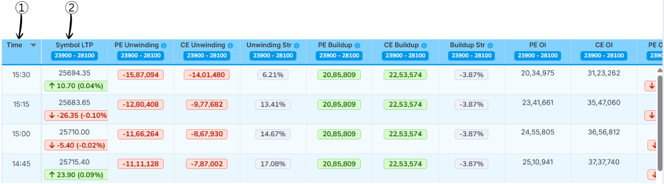
1Time
This column shows the exact time at which the market data was recorded.
In simple words, it tells when the Strike Flow (combined analysis) values were captured during the trading day, helping users track changes over different time intervals.
2Symbol LTP (Last Traded Price)
LTP stands for Last Traded Price of the selected symbol (such as NIFTY 50).
It shows the latest price at which the symbol was traded at that time. A green arrow indicates a price increase, while a red arrow indicates a price decrease compared to the previous interval.
OI Data (Unwinding)
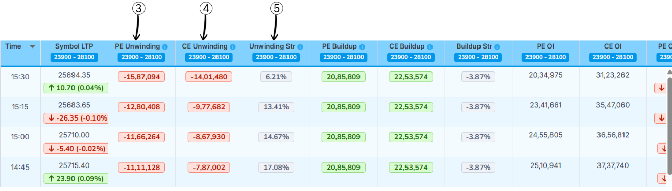
3PE Unwinding
This column shows how many Put Option (PE) positions are being closed or reduced. It tells us how much traders are exiting put positions.
How to understand the value:
- Values are shown in negative numbers because positions are being closed
- A larger negative value indicates more put positions are being exited
- Higher PE unwinding suggests traders are reducing bearish bets, indicating a shift in market sentiment
4CE Unwinding
This column shows how many Call Option (CE) positions are being closed or reduced. It tells us how much traders are exiting call positions.
How to understand the value:
- Values are shown in negative numbers because positions are being closed
- A larger negative value indicates more call positions are being exited
- Higher CE unwinding suggests traders are reducing bullish bets, indicating a shift in market sentiment
5Unwinding Strength (Unwinding Str)
Unwinding Strength shows the relative strength between Call unwinding and Put unwinding. It helps identify whether bullish or bearish positions are being exited more aggressively.
Formula
Unwinding Str % = (CE Unwinding − PE Unwinding) / (|CE Unwinding| + |PE Unwinding|) × 100
How to read the result
- ≥ +60% → Bullish (Call unwinding is stronger)
- -60% to +60% → Neutral (Both sides are balanced)
- ≤ -60% → Bearish (Put unwinding is stronger)
Example
- CE Unwinding = -15,00,000
- PE Unwinding = -5,00,000
Unwinding Str % = (-15,00,000 − (-5,00,000)) / (15,00,000 + 5,00,000) × 100
Unwinding Str % = (-10,00,000 / 20,00,000) × 100
Unwinding Str % = -50%
Result: Unwinding Str % = -50%, which indicates Neutral sentiment with slightly stronger put-side unwinding.
OI Change (Buildup)
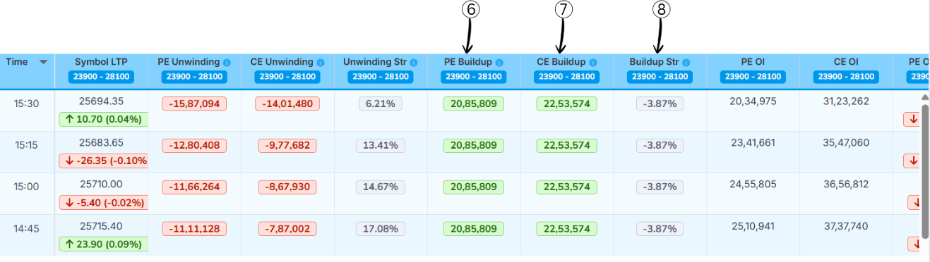
6PE Buildup
This column shows how many Put Option (PE) positions are being newly added. It tells us how much traders are creating new put positions.
How to understand the value:
- Values are shown in positive numbers
- A larger value indicates more put positions are being added
7CE Buildup
This column shows how many Call Option (CE) positions are being newly added. It tells us how much traders are creating new call positions.
How to understand the value:
- Values are shown in positive numbers
- A larger value indicates more call positions are being added
8Buildup Strength (Buildup Str)
Buildup Strength shows the relative strength between Put buildup and Call buildup. It helps identify whether the market is more bullish, bearish, or neutral.
Formula
Buildup Str % = (PE Buildup − CE Buildup) / (CE Buildup + PE Buildup) × 100
How to read the result
- ≥ +60% → Bullish (Put buildup is much stronger)
- -60% to +60% → Neutral (Both sides are balanced)
- ≤ -60% → Bearish (Call buildup is much stronger)
Example
- PE Buildup = 20,00,000
- CE Buildup = 10,00,000
Buildup Str % = (20,00,000 − 10,00,000) / (20,00,000 + 10,00,000) × 100
Buildup Str % = (10,00,000 / 30,00,000) × 100
Buildup Str % = 33.33%
Result: Buildup Str % = 33.33%, which indicates Neutral sentiment (not above +60% threshold).
Volume & OI Data
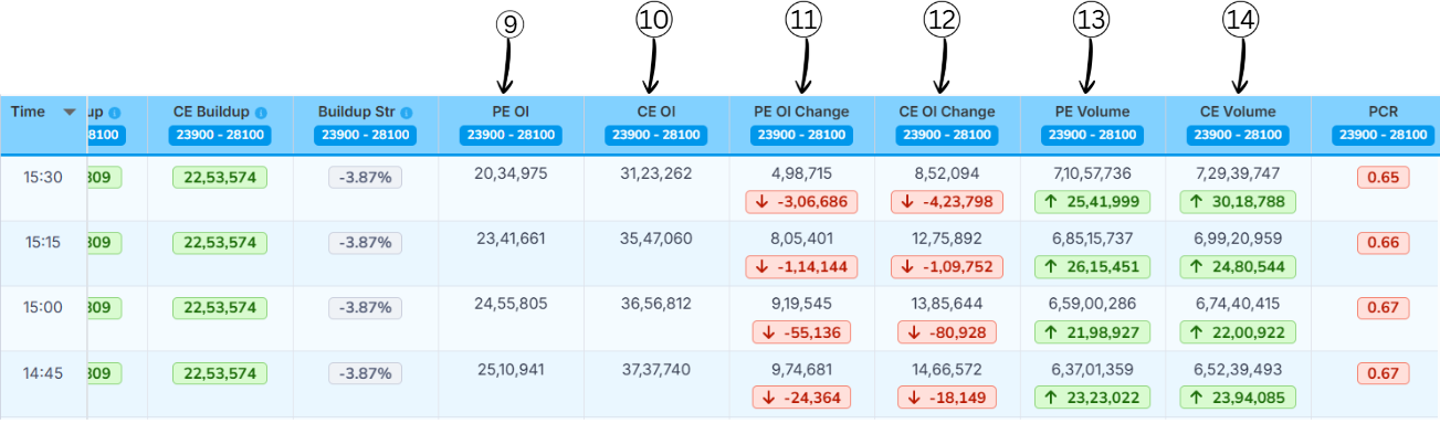
9PE OI (Put Open Interest)
This column shows the total number of active Put Option (PE) positions currently open in the market.
In simple words: It tells us how many put contracts are still open.
- Higher PE OI → Strong support area
- Shows heavy positioning on the put side
10CE OI (Call Open Interest)
This column shows the total number of active Call Option (CE) positions currently open in the market.
In simple words: It tells us how many call contracts are still open.
- Higher CE OI → Strong resistance area
- Shows heavy positioning on the call side
11PE OI Change
This column shows the change in Put Open Interest compared to the previous time interval.
In simple words: It tells whether put positions are being added or closed.
- Green value → New PE positions added
- Red value → PE positions closed
12CE OI Change
This column shows the change in Call Open Interest compared to the previous time interval.
In simple words: It tells whether call positions are being added or closed.
- Green value → New CE positions added
- Red value → CE positions closed
13PE Volume
This column shows the number of Put Option contracts traded during that time interval.
In simple words: It tells how actively put options are being traded.
- High volume → Strong interest on put side
- Confirms strength of PE buildup or unwinding
14CE Volume
This column shows the number of Call Option contracts traded during that time interval.
In simple words: It tells how actively call options are being traded.
- High volume → Strong interest on call side
- Confirms strength of CE buildup or unwinding
PCR & Max Pain Analysis
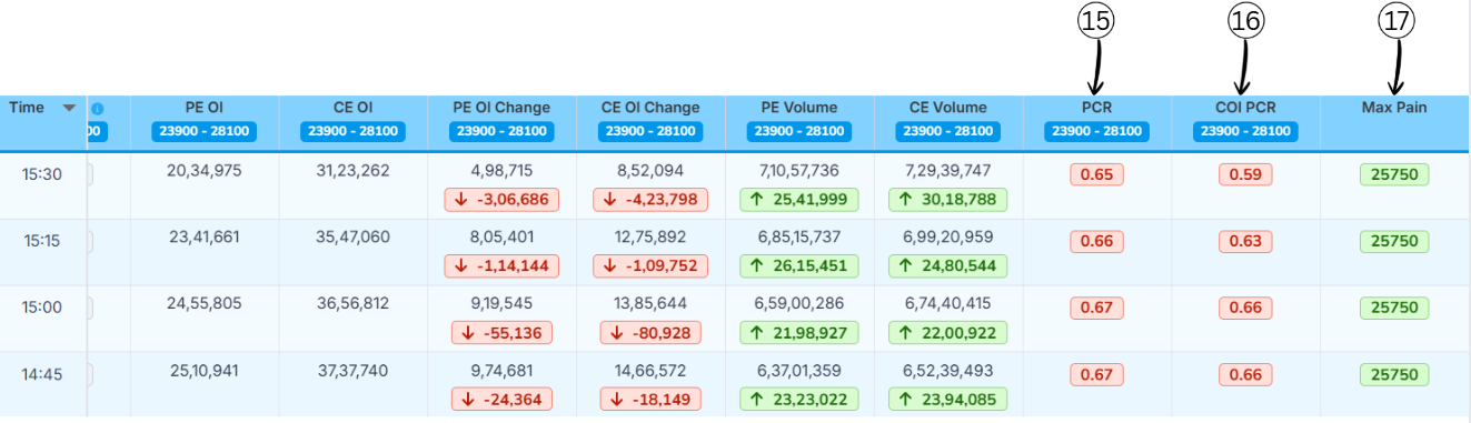
15Put Call Ratio (PCR)
Put–Call Ratio (PCR) is a market sentiment indicator that compares how many put options are being traded (or are open) to how many call options are being traded (or are open) for the same index or stock. It tells you whether traders, as a group, are more focused on protection/downside (puts) or on upside (calls).
PCR Formula
PCR = Total Put Open Interest ÷ Total Call Open Interest
Example:
- Total Put Open Interest = 24,00,000
- Total Call Open Interest = 20,00,000
Calculation: PCR = 24,00,000 ÷ 20,00,000 = 1.20
What PCR Values Mean?
| PCR Range | Market View |
|---|---|
| > 1.2 | Bullish |
| 0.8 – 1.2 | Neutral |
| < 0.8 | Bearish |
16COI PCR (Change in Open Interest Put–Call Ratio)
It shows which side added more fresh positions today — the put seller or the call seller.
COI PCR = Change in Put OI ÷ Change in Call OI
-
If COI PCR is above 1:
• More put OI was added than call OI.
• Put sellers are stronger → the market has a bullish bias. -
If COI PCR is below 1:
• More call OI was added than put OI.
• Call sellers are stronger → the market has a bearish bias.
Example 1
- Put OI added today: 30,000
- Call OI added today: 10,000
- COI PCR = 30,000 ÷ 10,000 = 3
- This means put sellers are much more active, so the market has a bullish bias
Example 2
- Put OI added today: 15,000
- Call OI added today: 30,000
- COI PCR = 15,000 ÷ 30,000 = 0.5
- This means call sellers are more active, so the market has a bearish bias
17Max Pain
Max pain (also called "maximum pain price") is the strike price where option buyers, in total, would lose the most money at expiry and option sellers would lose the least amount of money.
At this price, the maximum number of call and put options expire worthless or with very little value, so most buyers lose their premiums while sellers keep most of what they collected.
Many traders believe that, as expiry comes closer, the underlying price sometimes moves toward this max‑pain strike, because big option sellers try to hedge or manage their risk around that level. Max pain is not a guarantee or a magic target, just one way to see how positions are stacked in the option chain.